Aesthetic judgments are determined by a network of stimulus-, person- and situation-related influences. For instance, an individual’s emotional state, interest in the stimulus, economic or social status and education are important.
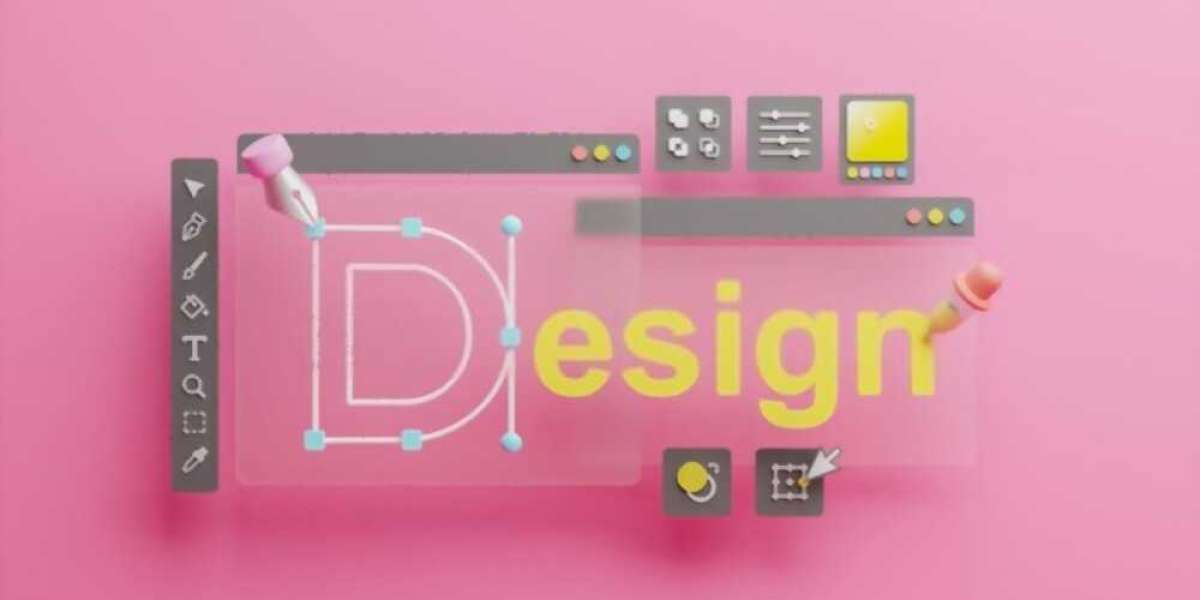
Brand Identity
Billions of businesses fight to stand out in a crowd, and branding identity design are how they do it. Brand identity defines the personality and values of a business, letting customers know exactly who they are dealing with. It includes a name, logo or symbol, tagline and more. The best way to communicate your brand’s identity is with visual elements like shapes, colors and fonts.
The most important aspect of branding is how it makes people feel about your business. Consumers make purchasing decisions based on emotions, not facts, so it’s crucial to deliver your message in an aesthetically pleasing and relatable manner. Having an unforgettable brand identity will encourage consumers to come back again and again.
Logos are the first thing that comes to mind when people think of a specific company. That’s why it’s essential to choose a design that is unique, memorable, and fits your brand’s personality. For example, Nasty Gal’s minimalist logo and social branding reflect their edgy and hip approach, while Seventh Generation’s green logo speaks to the brand’s sustainable values.
A strong visual identity should extend across all marketing platforms, including the company’s website and brick-and-mortar stores. This creates a seamless, cohesive experience for the viewer and helps maintain consistency throughout the brand experience. Inconsistency can confuse a customer and cause them to lose trust in the brand. For example, Gap’s 2010 rebranding flop resulted in an outcry from both consumers and designers for its confusing new design.
Visual Language
Visual language is the set of symbols and signs that communicate a brand's personality, values and messaging. Visual language is used in marketing to create a consistent system of communication that spreads across a brand's physical and virtual presence, allowing it to become instantly recognizable. Examples include logos, color palettes, chart styles, icons and layouts. The elements that comprise a company's visual language are chosen based on their ability to convey the desired traits of a brand.
A well-designed visual identity can have a significant impact on how a business is perceived. When combined with a clear and engaging message, a strong visual identity can help a brand stand out from its competition and forge a lasting connection with consumers. Consider how Coca-Cola's iconic red hue and script logo communicate a feeling of joy, refreshment, and nostalgia, helping to make the brand one of the world's most recognized and loved. The success of your business is dependent on your ability to connect with and engage with your audience. To do so, you need to have a clear and compelling message, and the right tools to get it out there. A professional graphic designer can be your best asset in creating a powerful and memorable brand identity that will leave your customers wanting more.
Visual Cues
Visual cues are elements that guide users through digital interfaces, making them intuitive and ideally enjoyable. They subtly hint at what the user should do next, and they can help create a clear visual hierarchy so users know where to go on your website. They’re also an effective tool for increasing conversions, as they direct attention and help users reach key goals like signing up for a service or filling out a form.
Visual prompts and cues are often used in classroom settings to help students focus their attention, remember and understand materials. They can be anything from a piece of paper on the wall to a physical object that students can hold in their hands. These tools are a powerful way to reinforce the learning process and improve memory, as they allow students to formulate their own mnemonic devices, take notes and make visual representations of the material.
A well-designed visual prompt or cue can influence students’ decisions and behaviors in a classroom, but these tools can be difficult to apply outside of the classroom. It’s essential to consider the audience of your design before implementing visual cues, as they may not be familiar with any symbols or graphical markings you use. It’s also important to ensure that your cues are accessible for all audiences, including those with color blindness and low vision.
While visual cues are an essential part of design, it’s important to keep in mind that they can have a negative impact on the user experience if not used correctly. Using visual cues for the wrong purpose or placing them in a way that isn’t conducive to your design can cause confusion, frustrate and even confuse your audience. To avoid this, it’s best to perform a round of usability testing on your design before launching it to ensure that your visual cues are working as intended.
Visual Hierarchy
In design, hierarchy refers to the order of visual elements within a composition. Hierarchy is a critical part of communicating with your audience and helps them understand what’s most important. Without visual hierarchy, a design can look like a giant wall of information that’s impossible to navigate and comprehend. But understanding the importance of hierarchy is one thing, and mastering how to create it in your own designs is a whole other thing. This infographic walks through the basic ways that designers create visual hierarchy, including concepts like size and scale, typographic hierarchy, repetition, leading lines, and balance. It also presents the most effective strategies for creating a clear and distinct message in your designs.
One of the most common ways to establish visual hierarchy is through differences in font size. This helps communicate that the text is more important than the background or other elements, which could be a call to action button or an image. But it can also be accomplished with colors, textures, and other effects. For example, a red flag on an otherwise white background instantly signals a warning or a call to action.
All of these elements can come together to establish a clear and distinct visual language for your brand. It’s essential for establishing your brand identity and effectively communicating with your audience. By following these visual-hierarchy principles, you can create a more organized and engaging design that’s easier for viewers to process and act upon.


